achievements of the
hands-on executives
interim-management finance and administration
specialists working for you when and
where you need them, getting paid only when you need them.

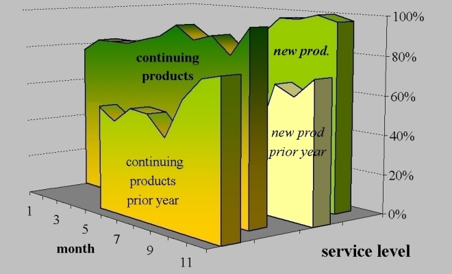
This chart illustrates the improvement in the service level achieved in
18 months in a highly seasonal business that replaces 40% of its products
annually.
The graph of the prior year is for every month exceeded significantly
by the results of the subsequent year, for the new articles (second set
of graphs) just as much as for those articles in their second and following
years (set of graphs in front).
Is your business also changing to quickly for the methods you are using
at the moment?